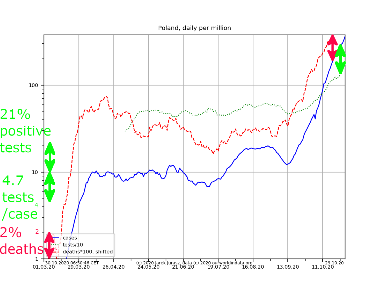
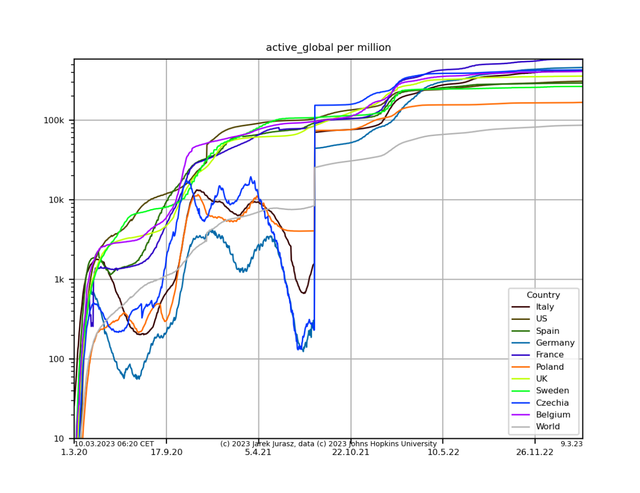
After my initial attempt at Covid 19 data I created another set of plots, which show the development per country. They are based on the data from ourworldindata.org, which include testing data from most countries.
Żeby naprawdę zobaczyć zmianę w tempie wykładniczego wzrostu, trzeba obejrzeć go w skali logarytmicznej, proporcjonalnie do populacji.