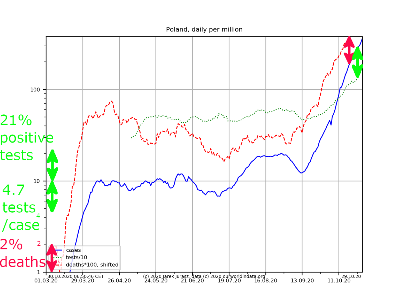
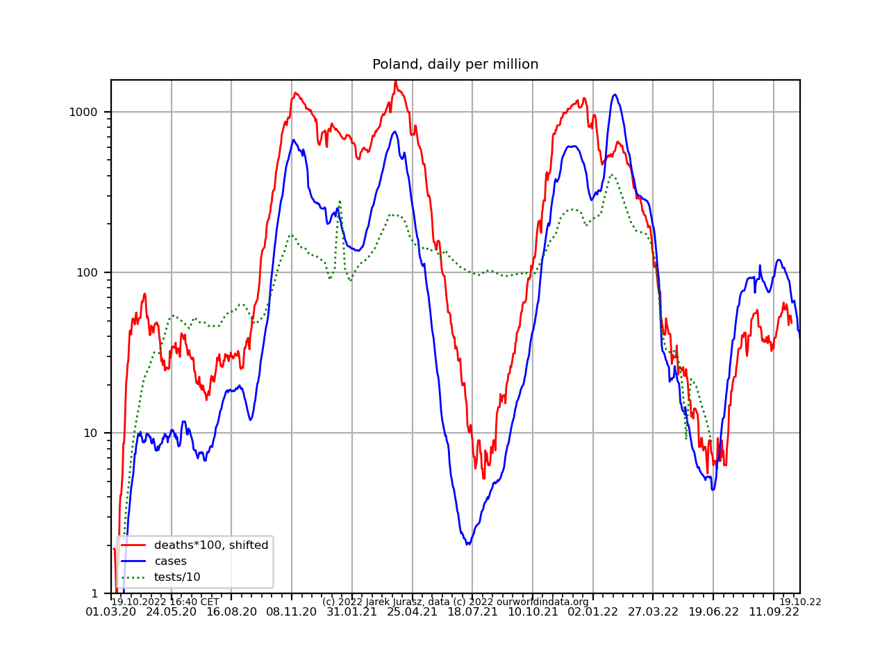
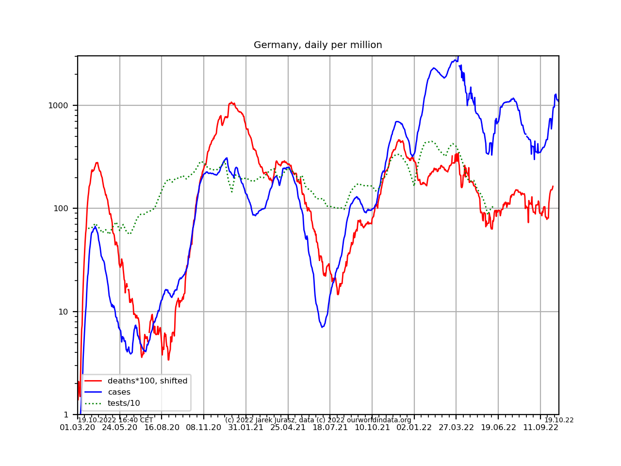
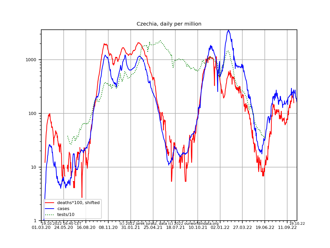
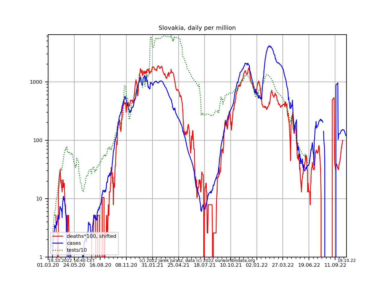
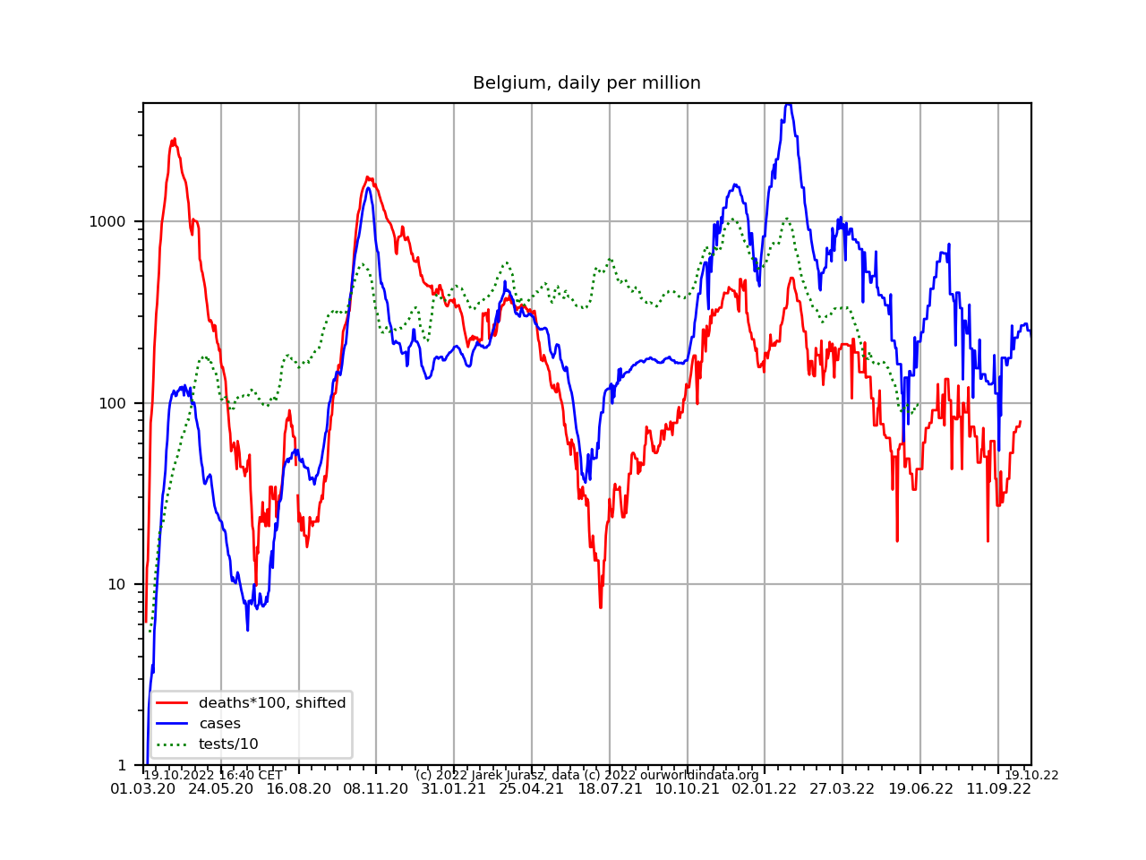
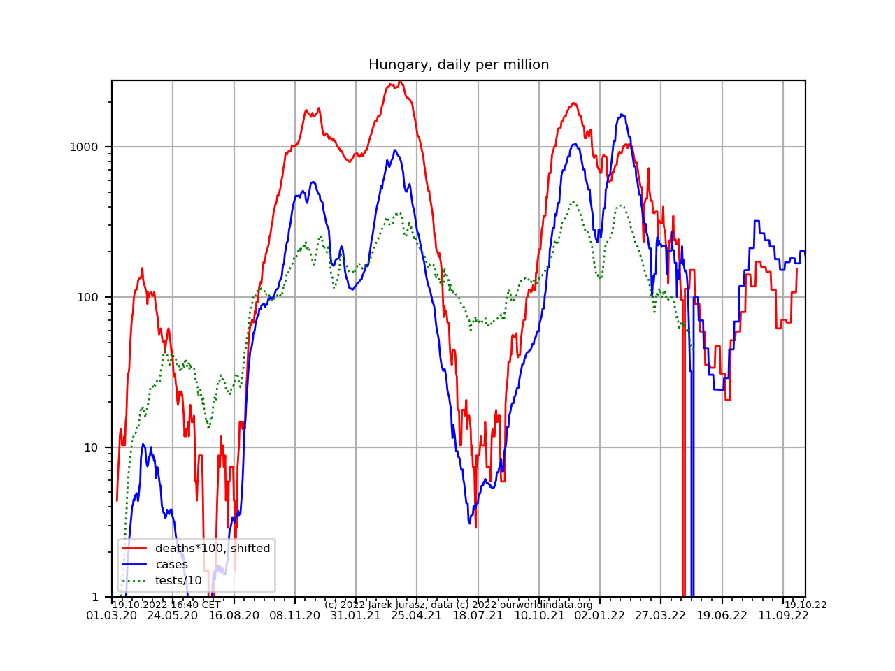
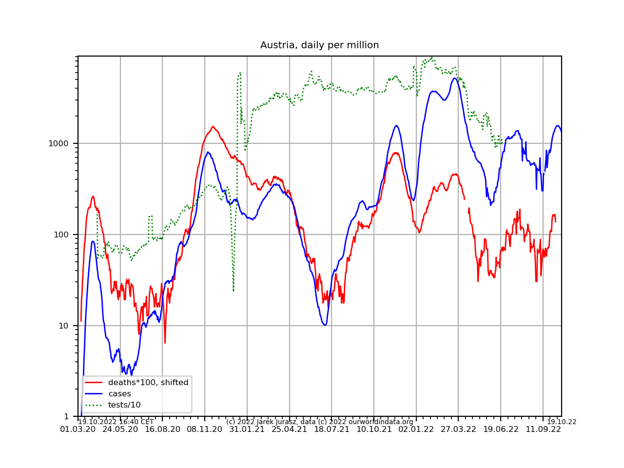
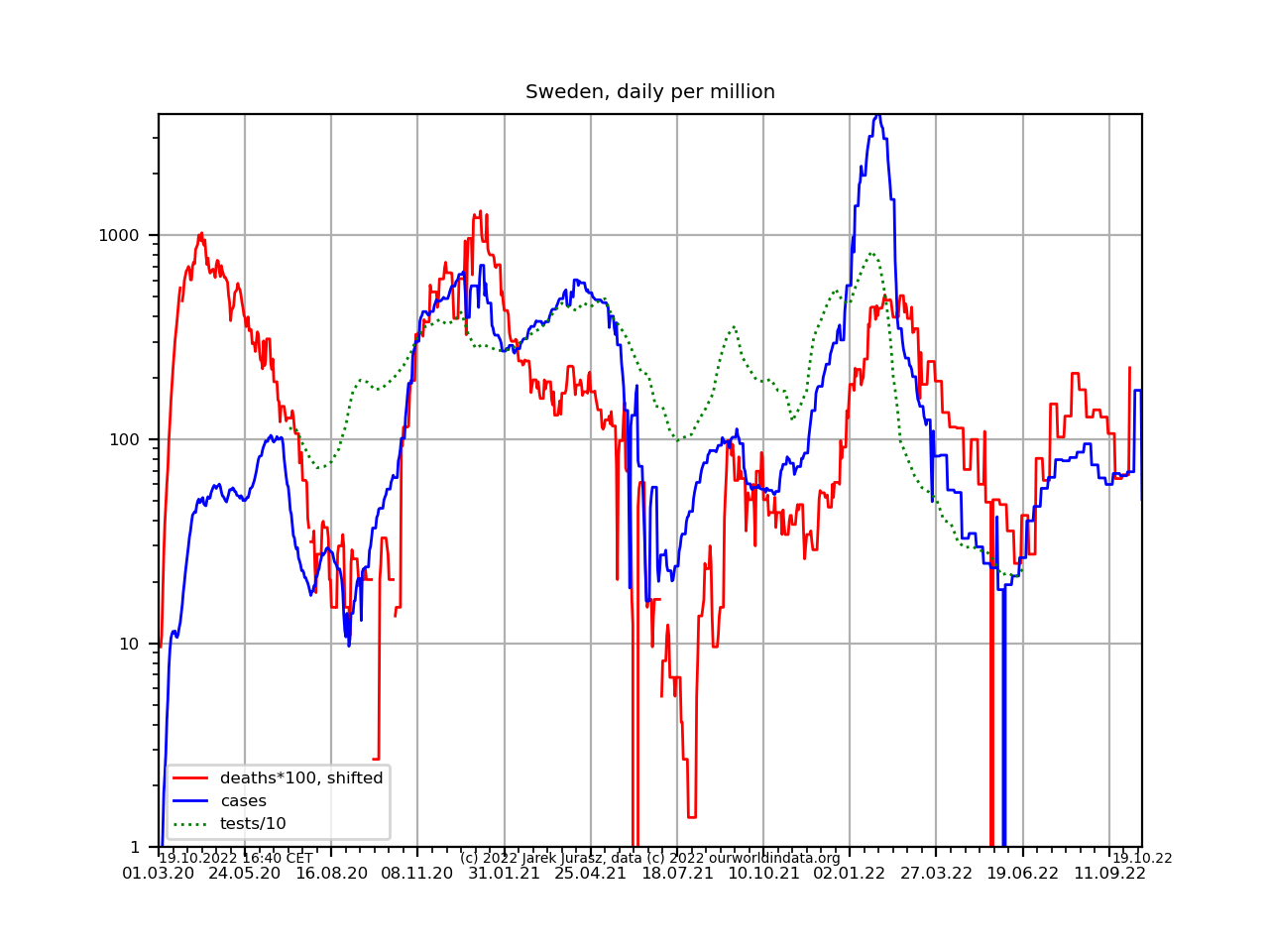
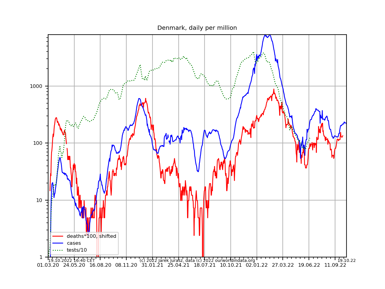
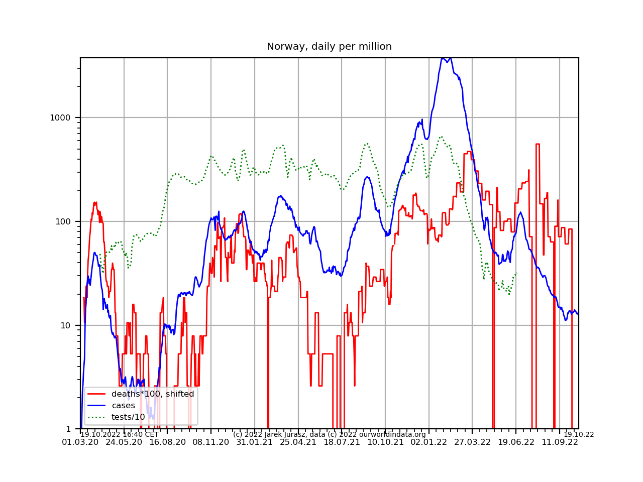
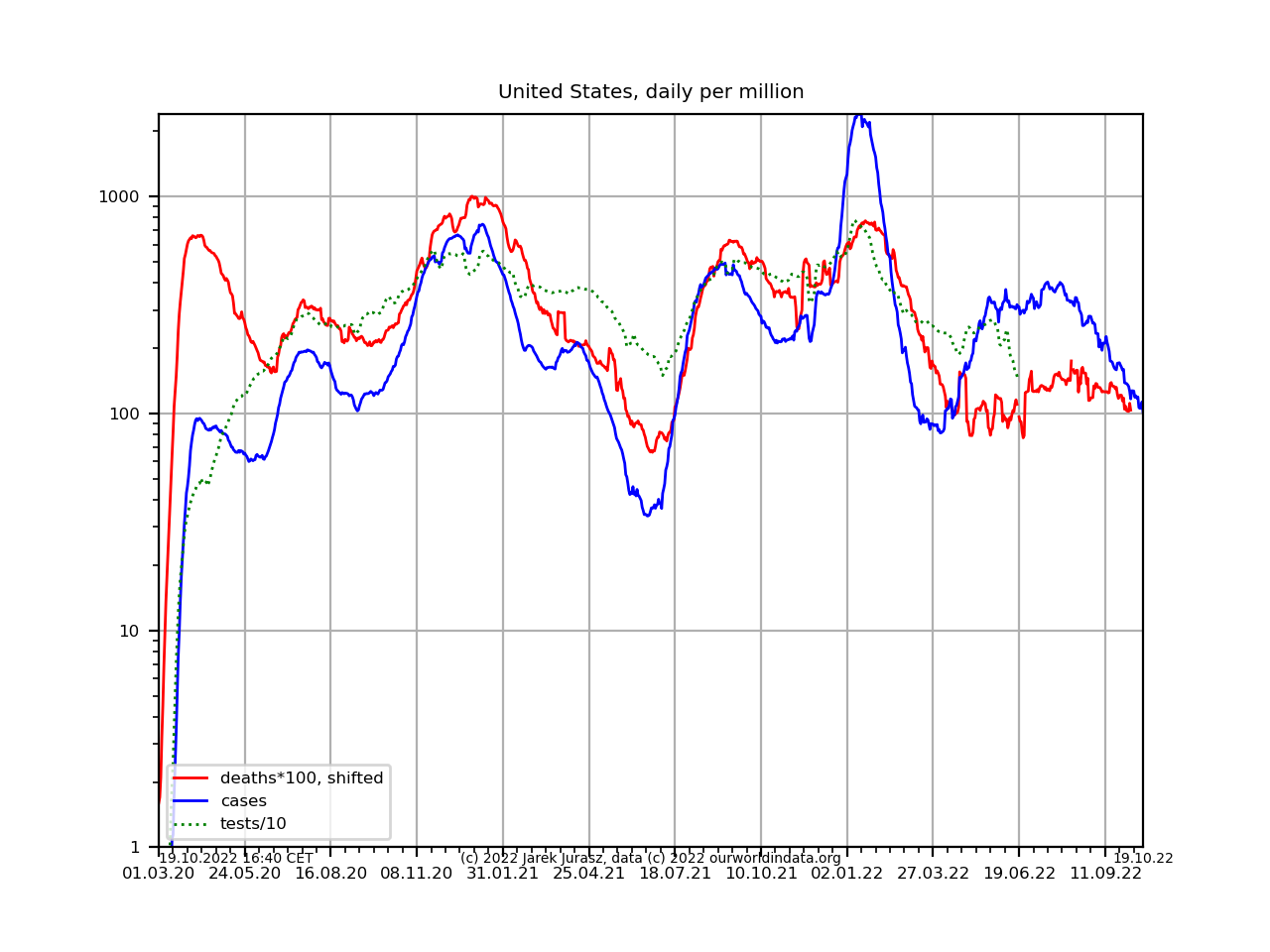
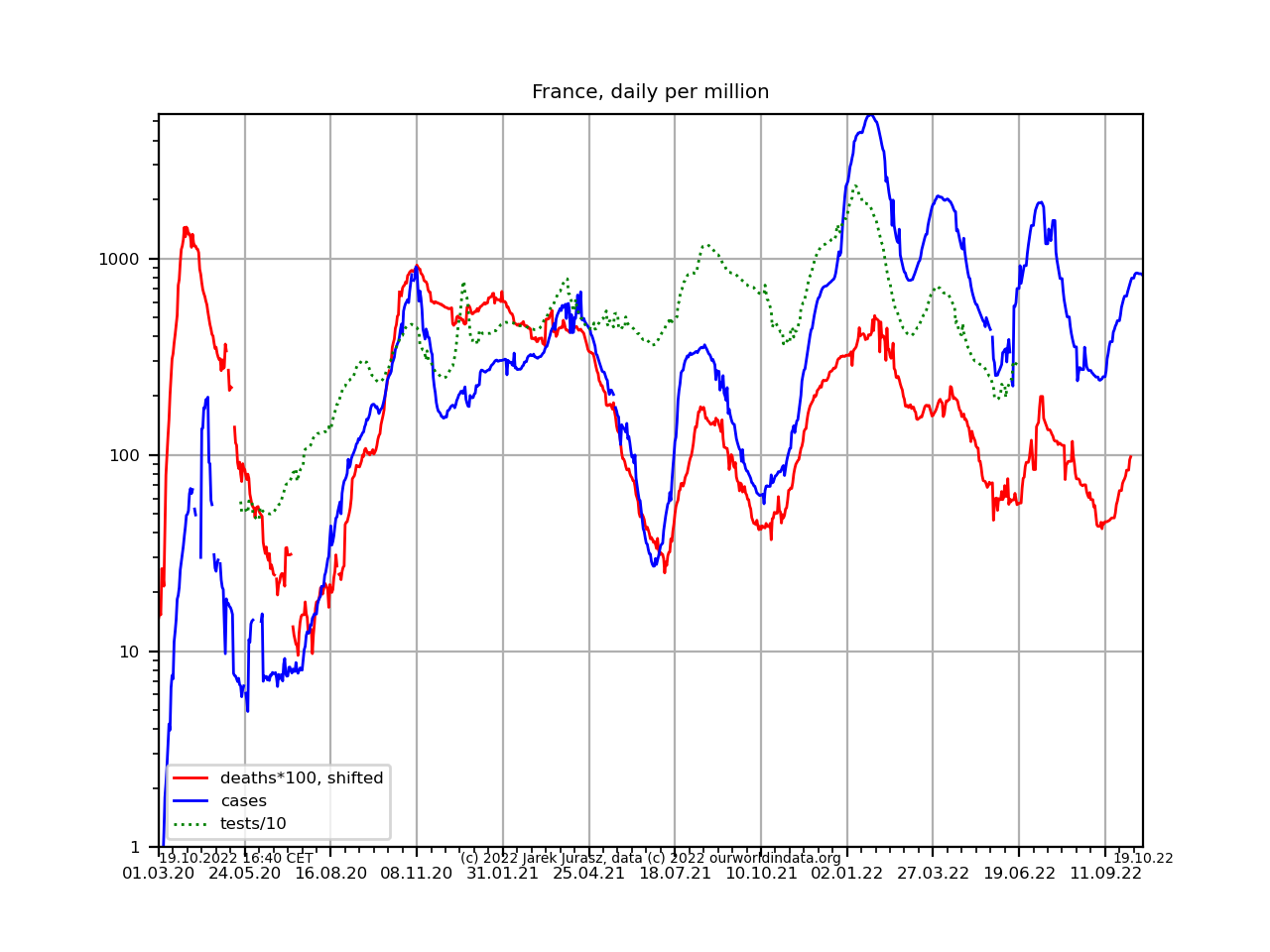
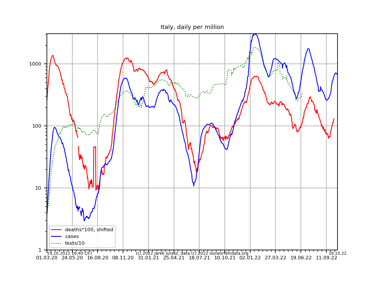
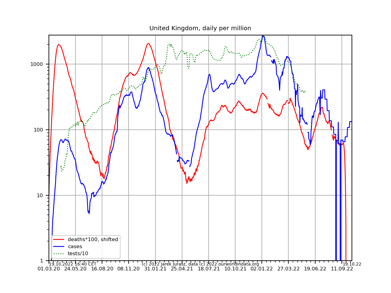
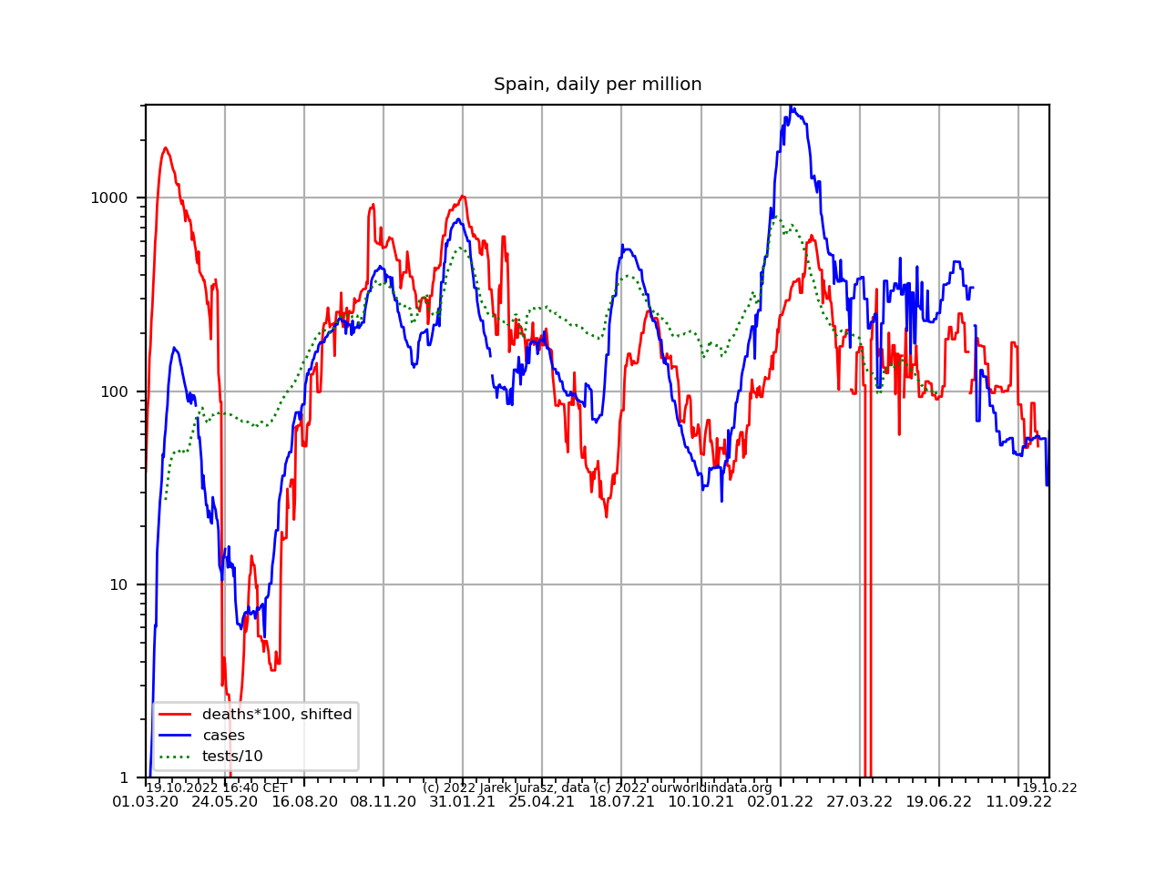
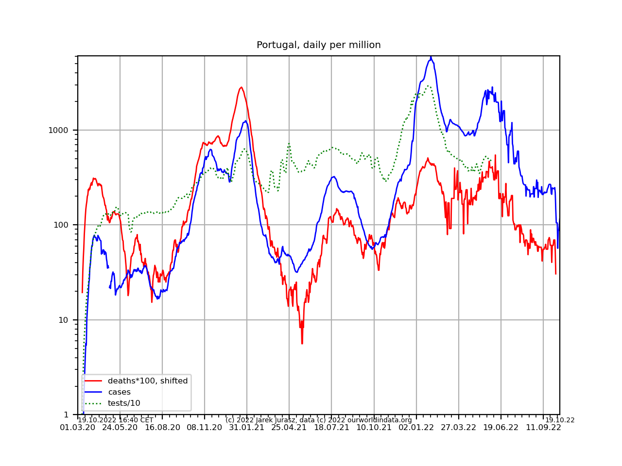
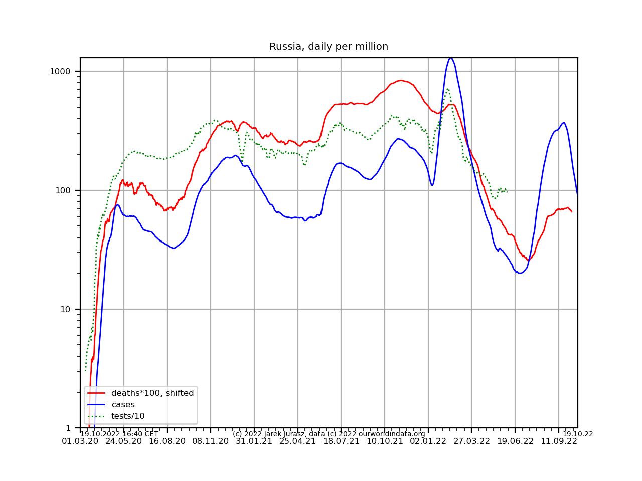
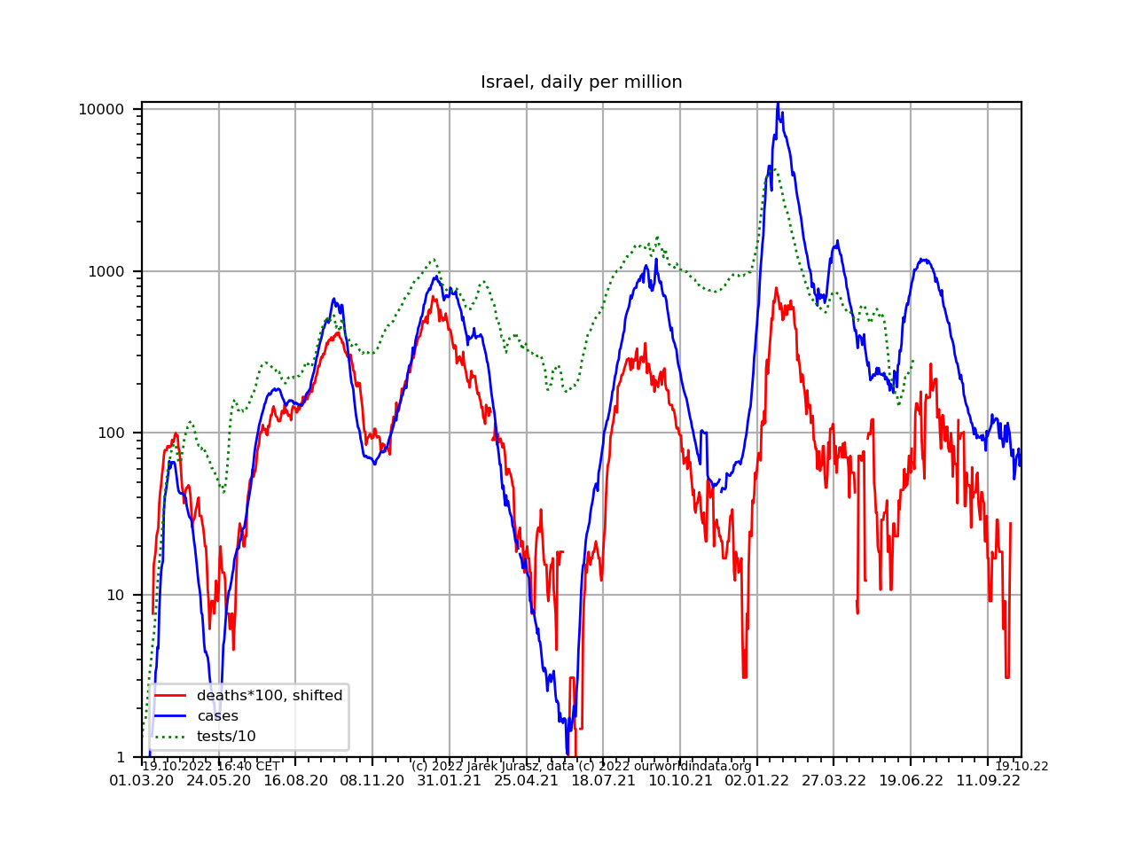
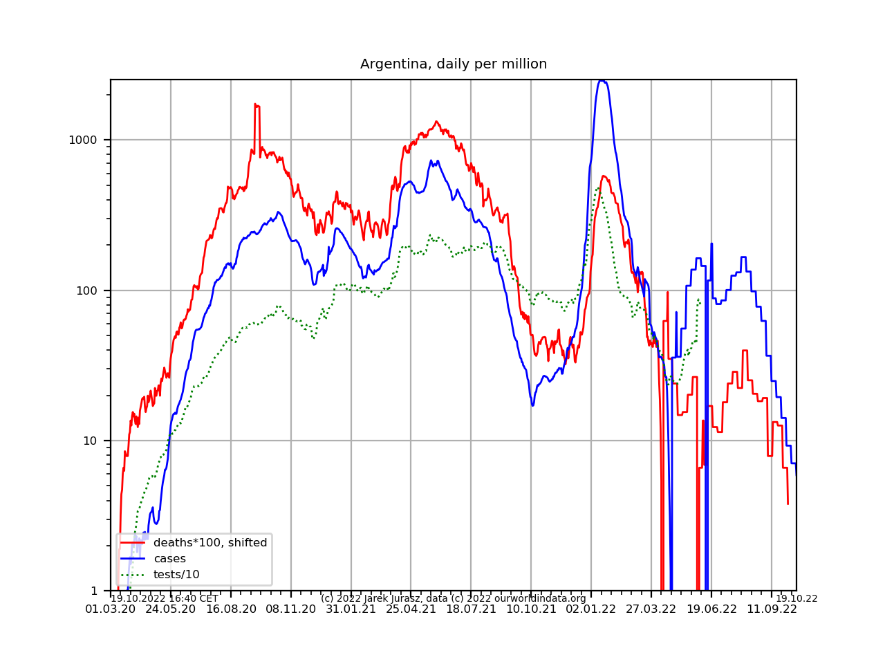
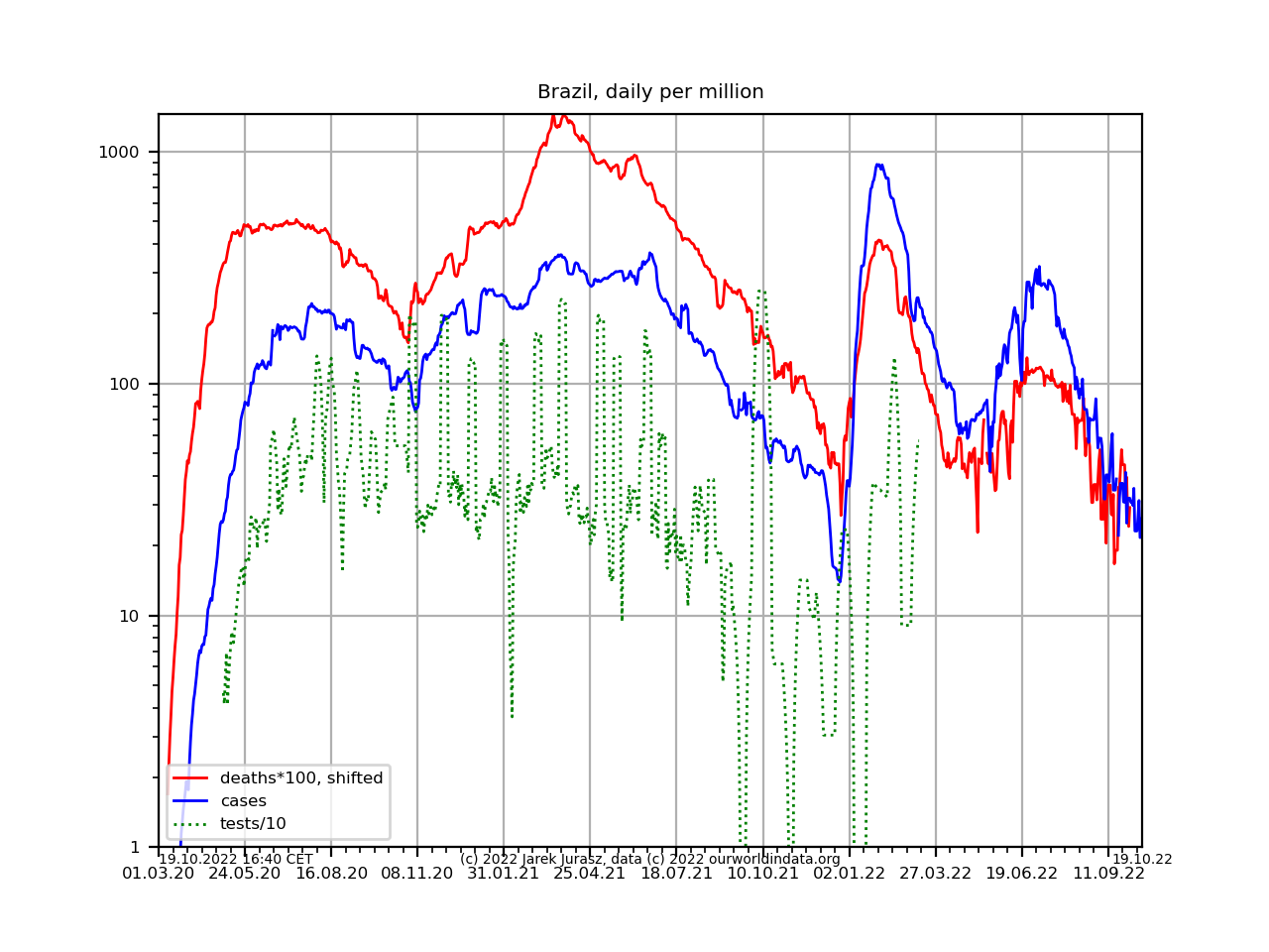
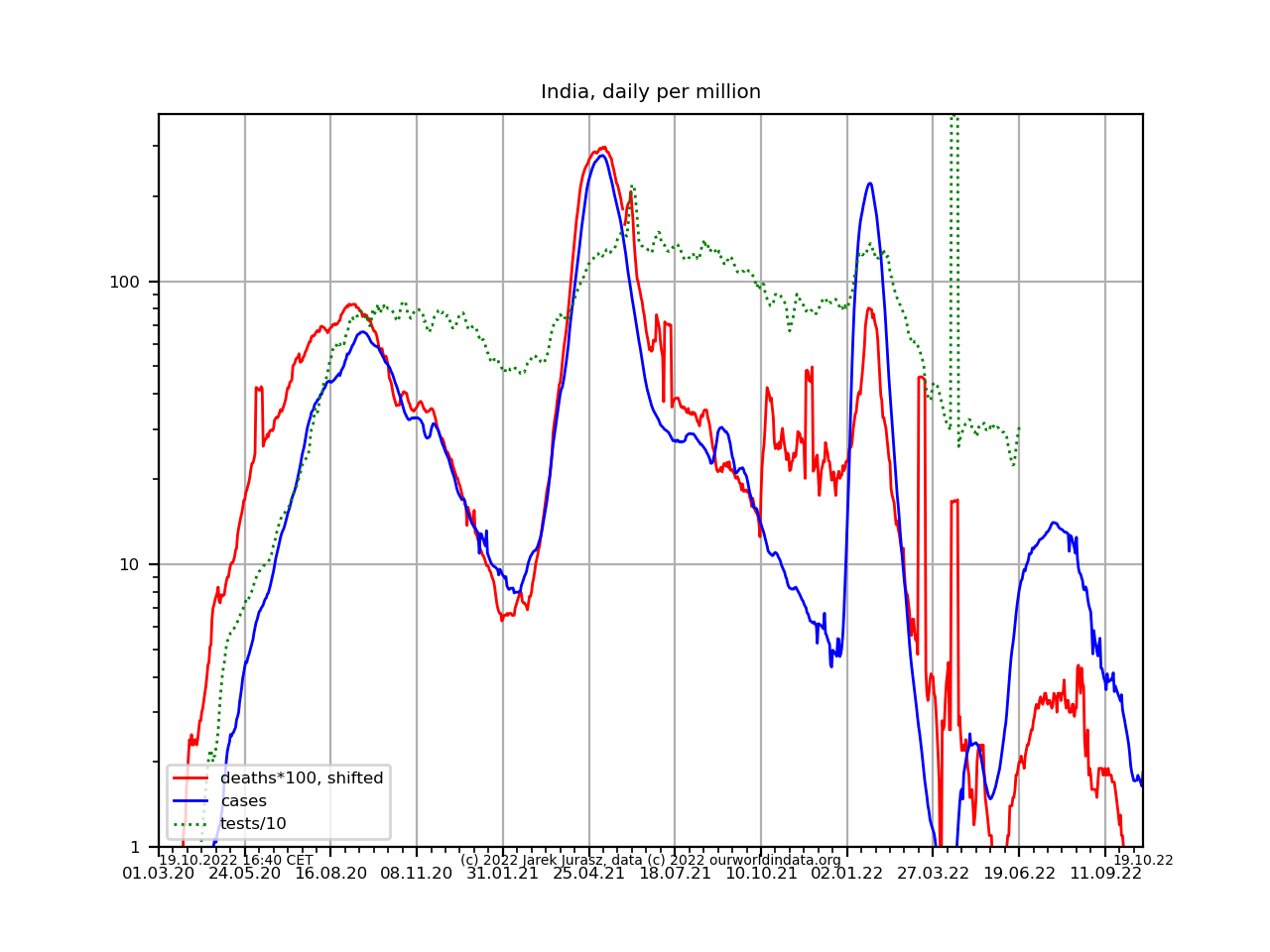
After my initial attempt at Covid 19 data I created another set of plots, which show the development per country. They are based on the data from ourworldindata.org, which include testing data from most countries.
In a search for a good presentation method, I found it best to plot these 3 logarithmic curves together, counted daily, smoothed and scaled per million of inhabitants (by ourworldindata):
- number of new Covid-19 cases
- number of deaths multipled by 100 and shifted 10 days back. This seems to be around the average time between the test and death, so the deaths are roughly attributed to the test day. If this curve lies on the number of cases, the mortality rate is 1%.
- number of tests divided by 10. If this curve meets the number of cases, the test positive rate is 10%. Typically a patient will need around 2 tests, a positive and a negative one. Some countries report 'tests performed', others 'people tested', often it is unclear. I do not make this distinction here.
You can use a piece of white paper or even fingers like a slide rule to estimate mortality rate, number of tests per case and test positive rate from the plot.
The time ticks are every 2 weeks. Click on the plot to enlarge it.
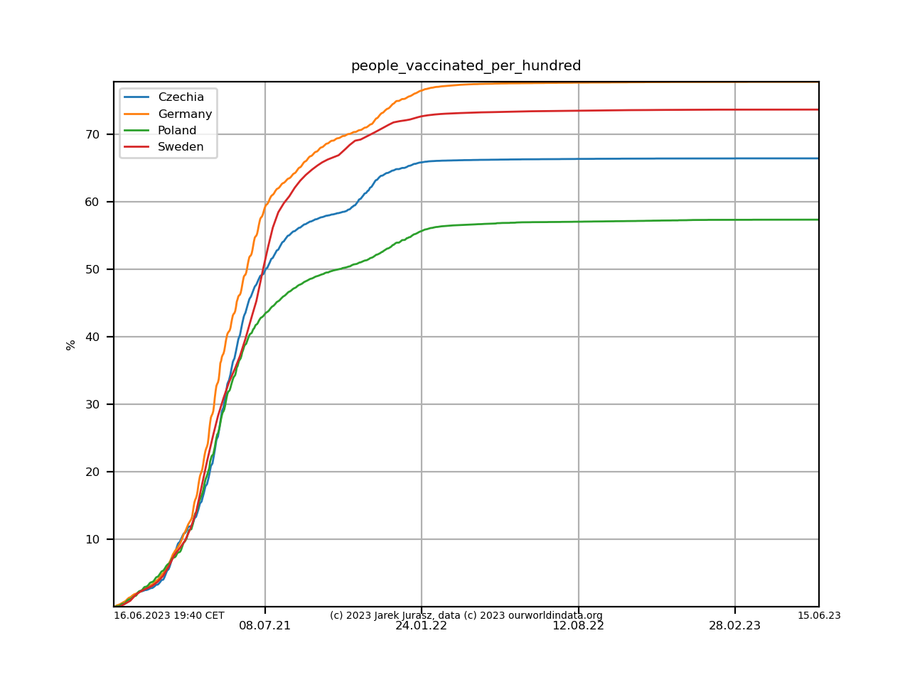
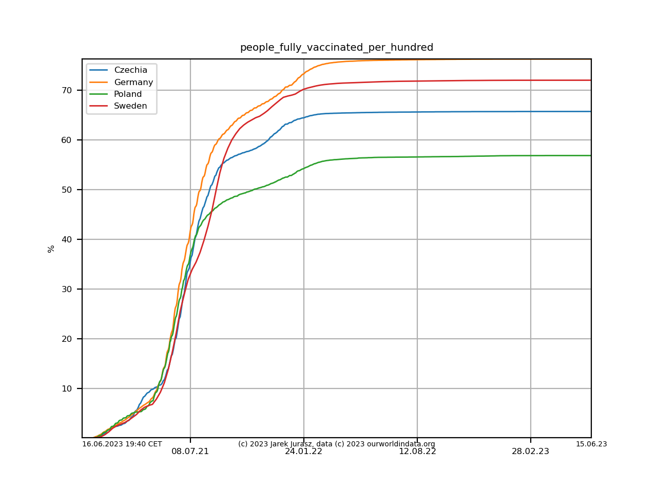
Vaccinations (at least one dosis/fully vaccinated):
To be continued. Updated regularly.