
There are plenty of plots out there to show the coronavirus pandemic already, but to really see the changes in exponential growth one needs logarithmic scale, relative to population size.
I wrote a quick Python / pandas script to visualise the status in some countries based on the data gathered at Johns Hopkins University for their excellent dashboard, available on the GitHub. There is an extensive background story by Prof. Laureen Gardner and a Lancet Infect Dis article to it. Similar dashboard of Robert Koch institute is available for Germany.
The worldwide data for confirmed cases, deaths and recoveries is (c) 2020 Johns Hopkins University. It is aggregated from different sources, cumulative, the numbers should not go down. I've visualised the data on a semi-logarithmic scale, scaled per million, calculated differences and I think some patterns are clearly visible.
I also recommend a very interesting animation by Aatish Bhatia showing the number of new confirmed cases against all of them.
Please see also my plots per country, including testing data.
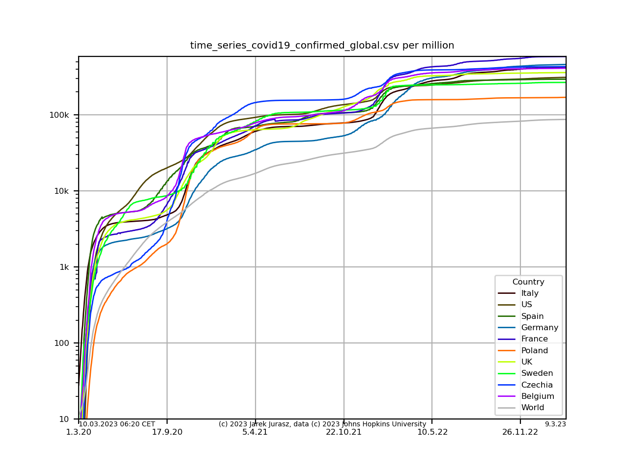
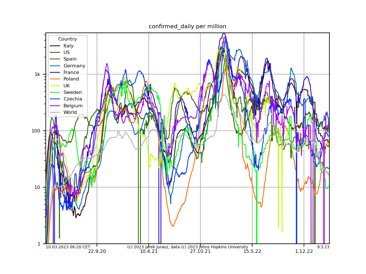
Confirmed cases
Confirmed cases (cumulative):
Confirmed cases daily (14 days moving average):
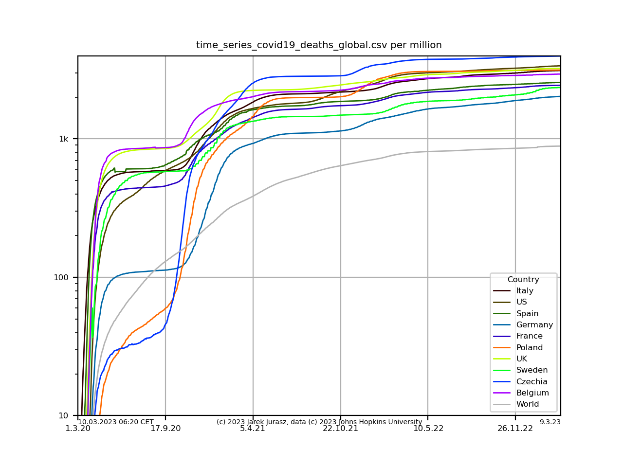
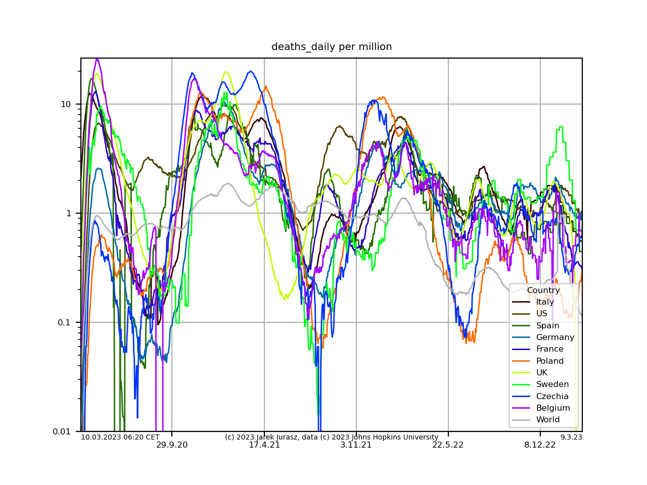
Deaths
Deaths (cumulative):
Deaths daily (14 days moving average):
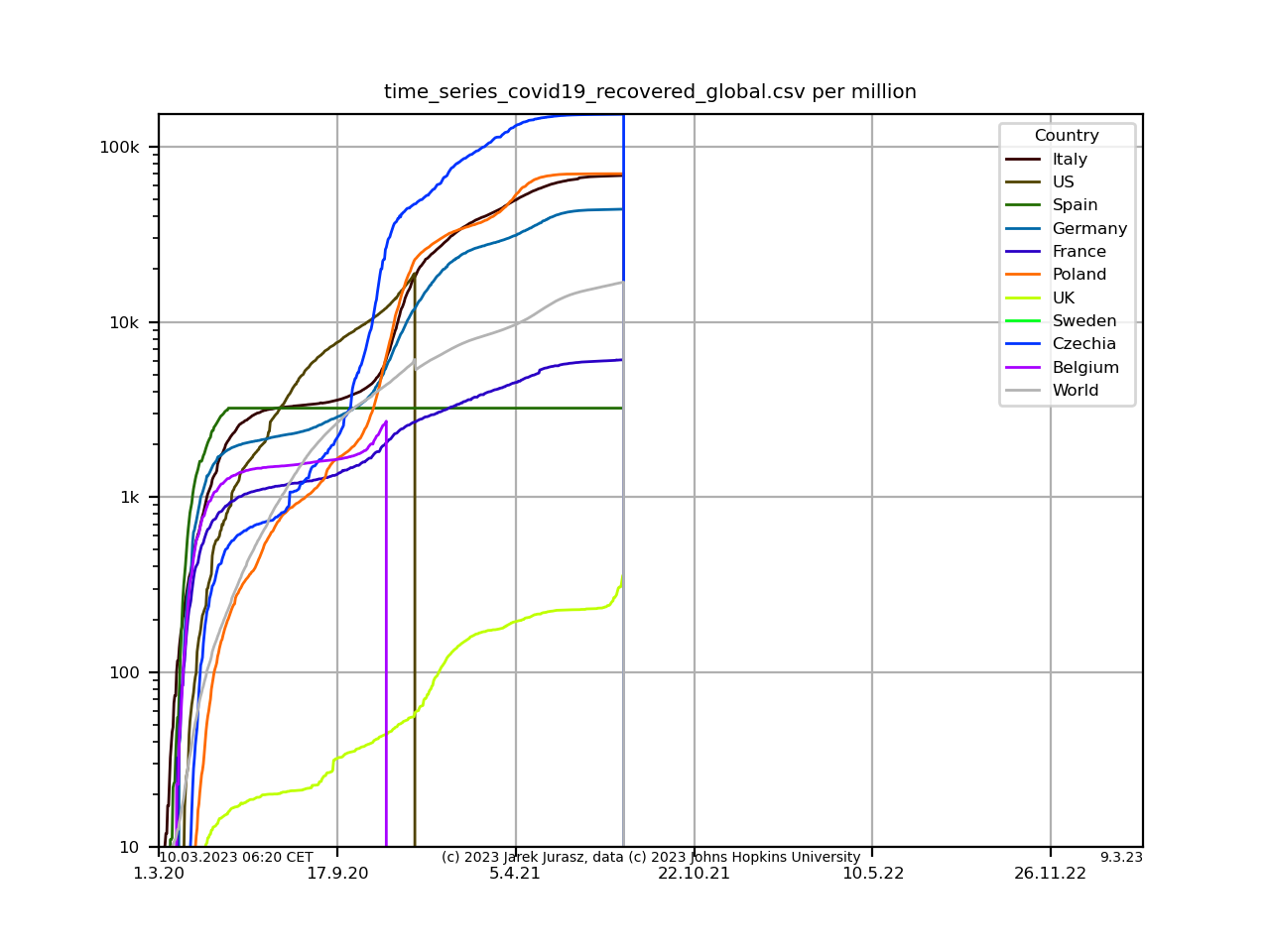
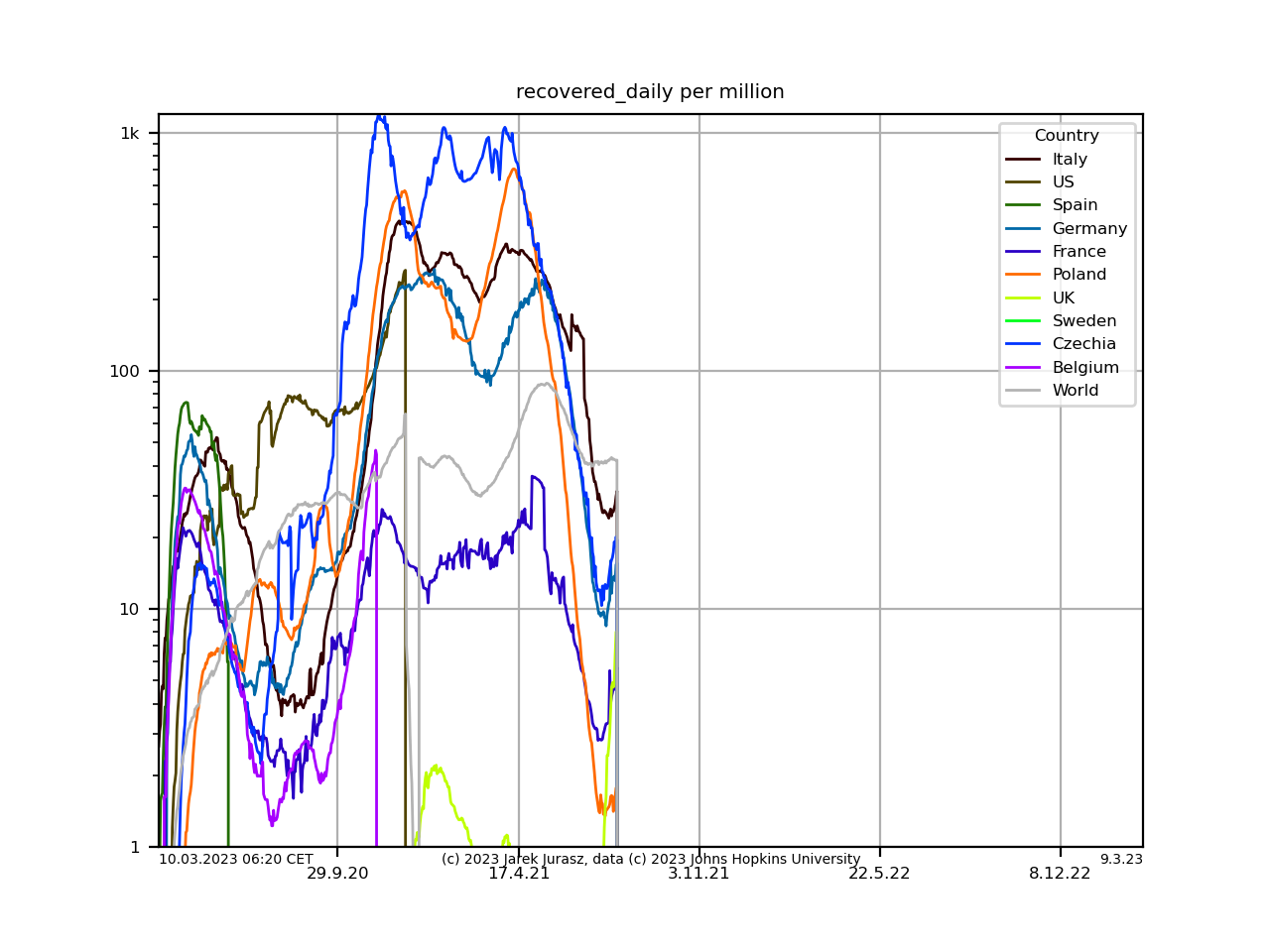
Recovered
Recovered (cumulative):
Recovered daily (14 days moving average):
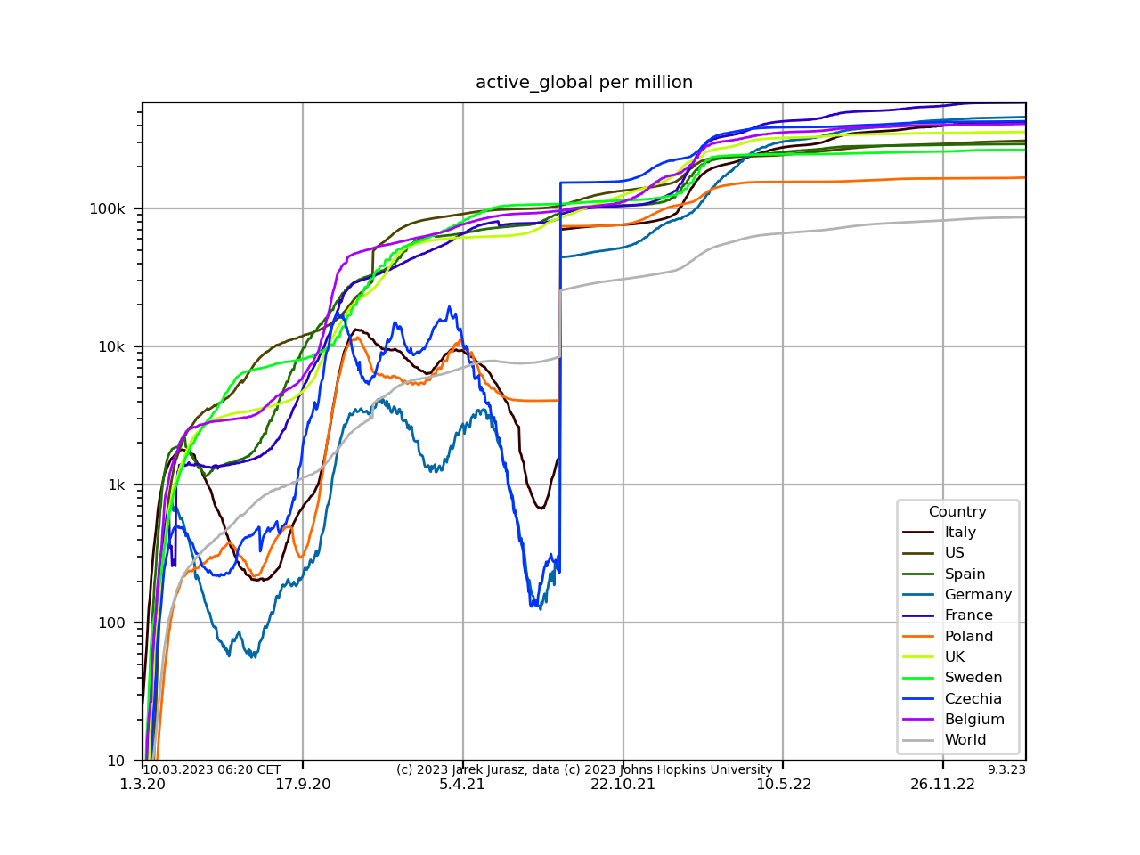
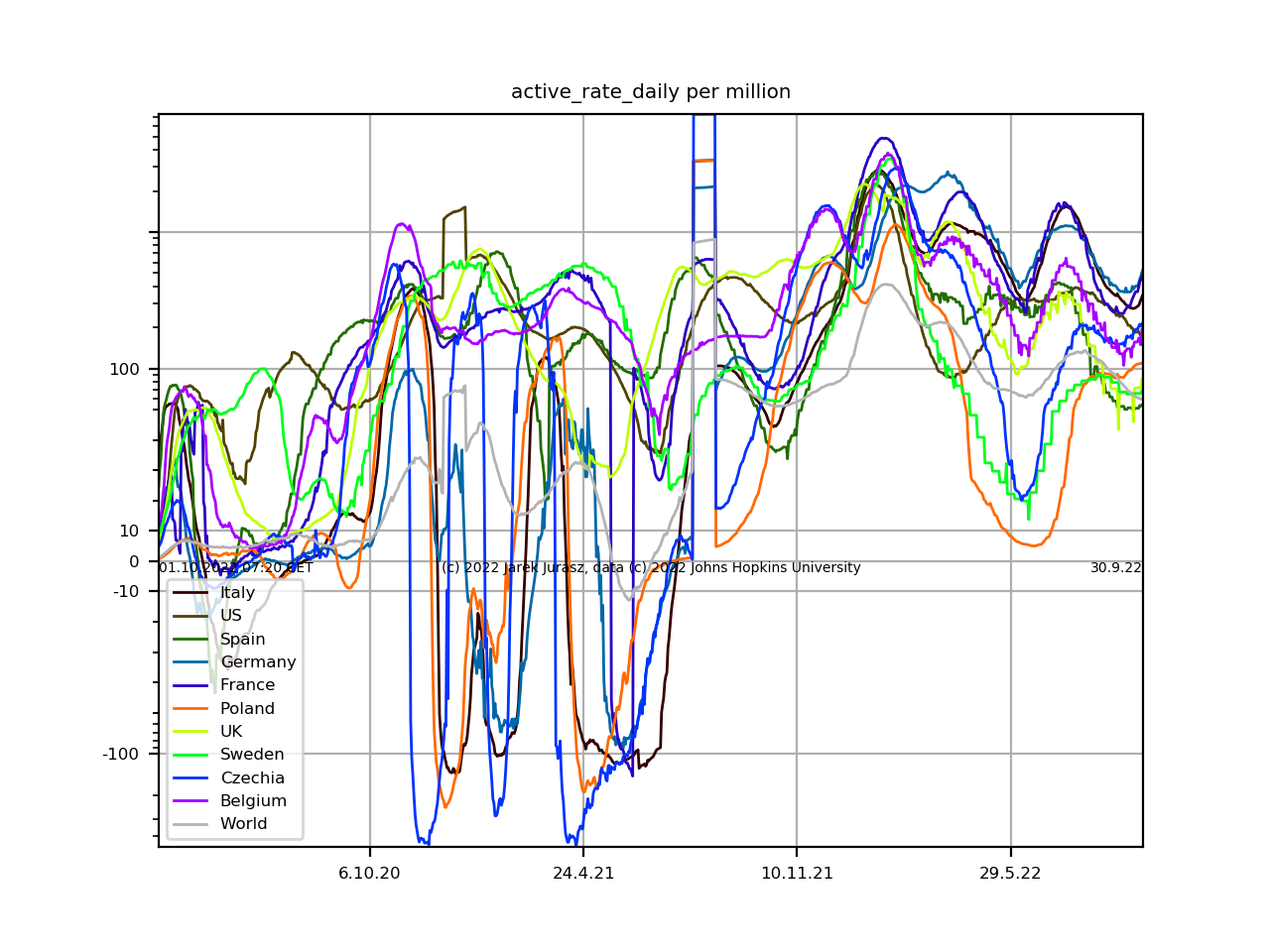
Active
Active cases (confirmed - deaths - recovered):
Active cases rate daily (14 days moving average):
To be continued. Updated regularly.